Plot Area
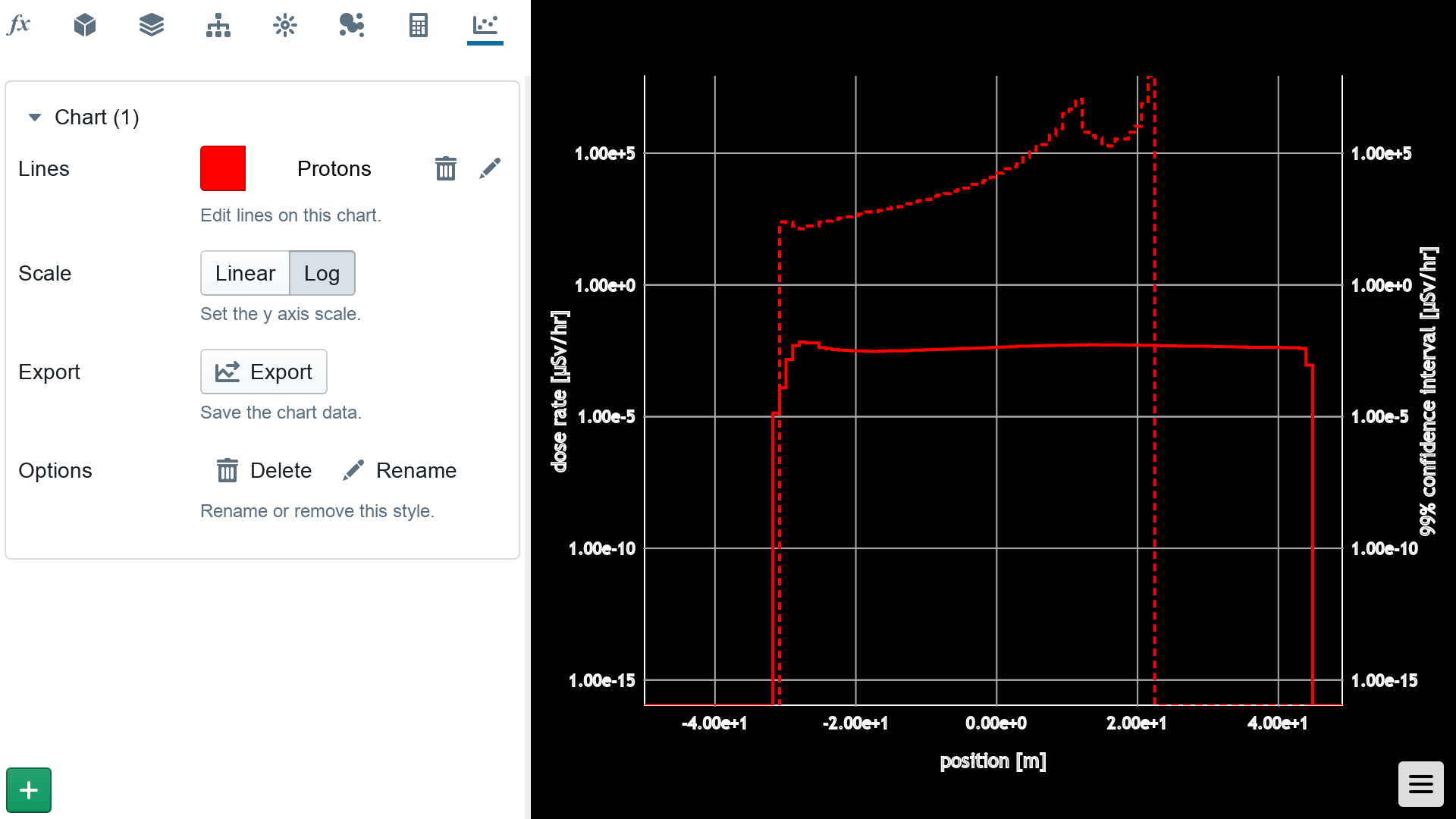
When on the chart tab, the 3D viewer automatically switches to the plot area. Add a chart using the plus (+) button in the bottom left hand corner of the chart tab. For each chart, you can choose between log or linear y-axis scaling, and optionally export the chart data in plain text CSV format.
Solid lines indicate dose rate data, and the dotted line indicates the 99% confidence interval for the data at the point.

Lines
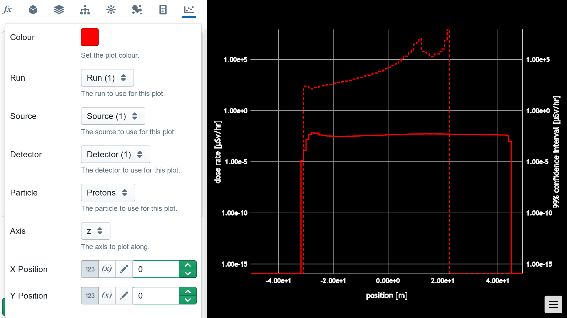
For each line on a plot, you can choose the origin of the data according to Run, Source, Detector and Particle. It is also possible to choose the axis over which to plot the data, and nominal the plot position in the other two directions.
Click on the line name in the chart name to view and change these options.

Uncertainty
As dose is accumulated in a detector, so is the sum of squares. From this, the 99% confidence interval is estimated, and shown as a dotted/dashed line in the plot.
To improve the uncertainty in your data, consider running the simulation for a longer period of time by increasing the number of particles released.